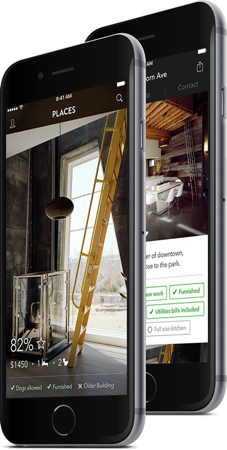


An experience design project creating a platform to help people find their ideal place to rent in a new city, while fostering a feeling of trust, transparency, and authenticity.
A platform that helps people find their ideal place in a new city. Users are offered their best matches based on their specific needs. This application provides a more authentic and trustworthy rental experience, bridging the gap between looking for a place and finally moving in.
Zillow is an American online realty company. They control 80% of the online realty market in the United States and users trust their platform to provide them with accurate real estate information. They currently focus on buying and selling homes, but also have a section of their site for finding places to rent.

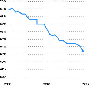
Zillow makes most of its profit from ads - which we thought was odd, since they have such a high market share in their sector. This made us explore the idea that this entire industry isn’t as lucrative as it once was, and that maybe it needs innovation to provide customers more value. Looking further into the industry, we found that the homeownership rate in the US is at a 15 year low.

The emerging trend is people renting, instead of buying because of economical and lifestyle factors. This is where we saw an opportunity for a design intervention.
Many people move cities often for work. Finding a good place to live in a new city is a really difficult task, because online listings only show what the lister wants the renters to see. Combined with the fact that they most likely know nothing about the neighbourhood or how they would like it, equals an unpleasant and often unsatisfactory experience for many renters.
We reached out to people who have previously rented in a different city on housing groups on facebook. There were many people who described poor experiences and were more than willing to share their stories with us. In total, we interviewed 9 people, and found some common issues.
"Before I moved, I was very frustrated with not being able to see places in person. I’m highly interested in the cultural significance of a neighbourhood, and wanted to explore where I would be living."
“I set up some viewings and stayed in an AirBnB for 3 days. Viewing places was the first thing I did, the day after I came into town. I was totally uncomfortable transferring money abroad - I needed to do it in person. I didn’t know the country or the language, so I was extra afraid of being scammed.”
“I kept track of everything with a google spreadsheet. Most of the time places filled up in about 2 or 3 days of being posted so there were a lot of crossed out entries because they filled before i got down to SF.”
The results of this research - perfectly summed up in these quotes - is what drove our design from here on out. We wanted to improve the experience for renters moving cities.
One of my major roles for this project was to create an interactive prototype of our application.
I used Pixate to create the prototype - which is really useful because it allowed us to test the interactions directly on a mobile device with native animations. I recorded a few clips of the interactions with touch locations so you see it in action.
When the user first opens the app, they're prompted to answer a few questions to help find places best suited for their needs. This is where we gather the information needed to get the best matches.
What's really important here is that we're not only getting the user's intent about a certain need, but also the magnitude of importance to them.
There are a few new interactions going on here, such as tap to like -> tap again to 'superlike' -> tap and hold to remove
The home feed is where the user is offered their best matches. We designed this section of the app to be big, bold, and beautiful.
The use of images is very important to create a strong visual connection with the place. To facilitate the fullscreen aesthetic, we made this section paginated.
While we tried to keep the feed as clean and simple as possible, we still wanted to offer users more information in a way that was easy to access.
We inluded a small section on the bottom of the photo where there is a quick overview of the information about a place. Swiping on this area reveals more quick bits of information. There is also an option for users to favourite places and save them for later.
Going into the details of a place shows the exact features that made it a good match for a user. They can see more information about the place, including more photos.
We designed this page with vertical scrolling because as an interaction, it's easier to continue scrolling than to tap into and tap out of a photo. If a user does go into a photo, they can exit that fullscreen view by simply scrolling up.
When showing the location of a place, we felt that it wasn't enough to simply show where it was.
We really wanted to show context of the neighbourhood and the surroundings, to give users a more authentic feel for the area - as if they were getting insight from a local.
We also sourced content from geotagged Instagram photos, to further get an authentic feel for the area based on what the locals truly see there.
We wanted the rental experience to be as seamless as possible - because currently it is quite fragmented when trying to contact a lister.
By contacting the lister within the app, it's easy to manage conversations.
We've provided video calling as a feature as well to further facilitate a trustworthy and transparent line of communication between the lister and the renter.
Back to the main screen, the navigation of the app is split into three sections: Profile, Feed, and Explore.
Users can navigate between these sections by swiping side to side, or by tapping on the icons on the top corners.
This builds off of an interaction pattern found in many new apps.
This is where all the user's favourite places are located. They can also filter them by certain parameters to compare places.
All of the user's conversations can also be accessed from here.
And if a user wants to list a place of their own, this is where they would do that from.
This section of the app draws from the metaphor of walking down a street and stumbling upon a place that you wouldn't have known to look for.
Users are shown places that might not be the best matches, but may have some other interesting aspects to them.
While 'exploring' a neighbourhood, users can swipe down to see authentic reviews of places within the area from Foursquare.
What I Learned: The biggest thing that I learned from working on this project was the value of perseverance. At many point during the course of this project, we felt like we were spinning our wheels, or had come up to a dead end. But after regrouping, clearing our minds, and tackling the problem from a fresh angle week after week, we were able to finally come up with something we felt proud of.
What I Would Improve: Because of the limited timeframe of this project, we weren't able to explore or design any onboarding for our app. If I were to work on this further I would try to design an efficient and pleasing onboarding experience for new users - because currently many of our interactions are hidden, and may be hard to discover for unfamiliar users.