
An experience design project which aligns all the digital channels of The New Yorker Magazine into one digestable daily dose of content via engaging videos in a mobile application.
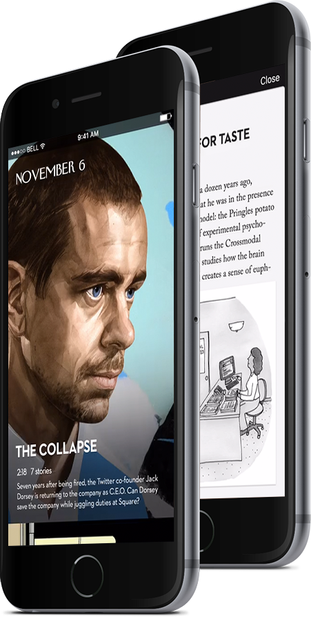
An application that aligns all of the New Yorker’s digital content into one curated experience. A daily dose of handpicked content is delivered to the viewer by an editor or a writer in the form of an interactive video. Full written content and other calls to action are offered directly on the same screen as well to encourage deeper reading and engagement.
The New Yorker is an editorial magazine that provides readers with long-form opinionated content based on cultural commentary. They published their first issue in 1925, and have been pumping out 47 issues per year ever since. They have a total print circulation of just over 1 million to this day - which is impressive for a print magazine of this genre in this day and age.

It may seem impressive, but it’s not a positive outlook for the future because print subscriptions are steadily declining - not only for the New Yorker, but for the entire print industry. This is concerning for the business because The New Yorker relies on its print subscriptions for revenue. In 2014, the company tried to keep up with the times by updating their online presence. They now publish over 17 stories daily on a handful of different digital channels: their website, application, e-reader app, podcasts, videos, and various blogs.
Looking into the popularity of the magazine, we found some interesting phenomena revolving around the readers. People subscribed to the print magazine had stacks of unread magazines sitting on their coffee tables, simply because there was just too much content. Because of this, many subscribers were starting to cancel their subscriptions because they felt they weren’t making the most of it anymore. However, they still appreciated the long-form content that the New Yorker provides, and didn’t want the magazine to convert to a ‘Buzzfeed’ style bite-sized content provider. At the intersection of information overload and valuable, engaging content is where we saw an opportunity for innovation by design.
We created an interactive prototype with Flinto.
Prototyping was really useful because it allowed us to test the interactions directly on a mobile device with native animations.
Scrolling ahead and tapping on one of the cards allows a user to skip to that part of the video
We also give users the full content so that they can dive deep